

Amazon eCommerce Livestream
Reading time: 15 minutes
My Role
Shiba Neko is a design agency that provides innovative design solutions to companies by collaborating internally & externally collaboration.
Reorganized 'information architecture' by creating 'flow charts, site maps, and wireframes'; conducted 'card sort' and 'tree tests' to test the usability of the information architecture. It turned out the final average successful rate of user usability was 97%, which led to the 'search function' being improved and 'the page conversion rate' increasing.
Optimized Onboarding and E-Commerce Shopping Cart features through 'user testing' and 'prototype iteration'— eliminating estimated turnaround times to drive business growth.
Identified user needs by conducting use usability testing, which includes heuristic evaluation, cognitive search, and user testing.
Determined 'product priorities' and 'product listing positions' by conducting 'quantitative and qualitative analysis,' 'Amazon AMS analysis," and "competitive product analysis."
Tags
#UX/UI
#IOS mobile
#design system
#user research
#Product management
#agile design sprints
#eCommerce
Duration
4 months
Background
Amazon e-commerce live streaming is a shopping experience provided by Amazon, which combines online shopping and social interaction. It allows users to interact with sellers through online video live streams and make purchases. Its business profit model is: As more items are added to the shopping cart, the likelihood of making a purchase also increases.
️Problem
While Amazon has a large user base, the proportion of users using the Amazon e-commerce live streaming feature is relatively low, and among these users, the number of items added to the shopping cart is also not high.
️Design Goal:
Make more users visit the checkout page and add more products
Survey: 868 responses
Participant Selection: Choose individuals who have previously used social or shopping websites with live streaming capabilities.
Objective: Collect quantitative data on the age, interests, internet devices, and product preferences of potential users.
Interview: 30 users
Participant Selection: Choose individuals who have previously used social or shopping websites with live streaming capabilities.
Objective: Collect quantitative data on the age, interests, internet devices, and product preferences of potential users.
Persona
by using quantitative & qualitative insights

Funnel analysis + Journey map
I researched from the funnel model(business analysis) to the journey Map (user analysis) to break design goals into two sub-design goals.

Break Down Design Goal:
Increase 'homepage' to 'live page' user engagement
Simplify product adding to the shopping cart on the 'video page'
Competitive Analysis
We conducted a competitive product analysis to gain inspiration for future design ideas. Our selection of competitors comes from previous survey insights and desk research.
Direct Competitors - with Live Shopping
Indirect Competitors - with live features or shopping sites
Workshop
Brainstorm (divergent )
Based on previous funnel analysis and user journey map, we conducted brainstorming and open discussions, resulting in numerous user stories. This process encourages innovation and creativity.

Solutions (convergent)
Next, we utilized the MoSCoW analysis method, combined with finding a balance between user needs, technical constraints, and business objectives, to converge on solutions. This helps in determining project priorities and forming the next steps in the action plan.

Card sort
A total of 15 users were requested to classify the cards and divide them into three categories to ensure that navigation aligns with the user's mental model, as the first two layers are crucial for retaining users
Information architecture
Based on the cart sort resuhe navigation bar is divided into: Discover, Follow, and Categories
New IA x User flow
Combining the above design ideas and information architecture research, I created a diagram combining new information architecture and user flow.
It is divided into three stages: choosing search ways, searching process, and watching streams.
Lo-Fi wireframes
Based on the above user flow and interface layout research, I drew the first version of all Lo-Fi wireframes.
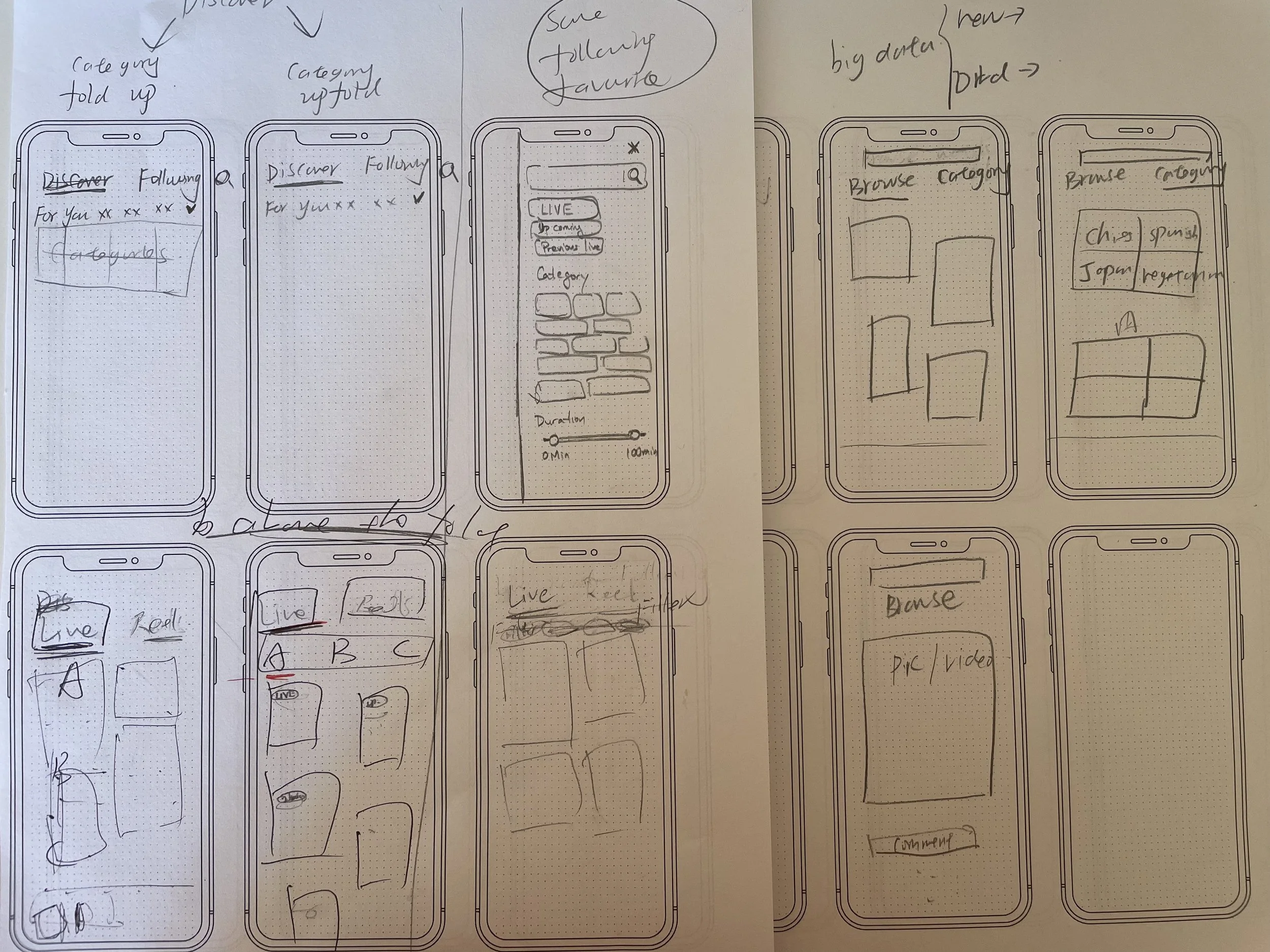
4 iterations with testings
In the process of transitioning from wireframes to high-fidelity mockups, we conducted four iterations. During these iterations, I conducted metrics setting, conducted cognitive walkthroughs, heuristic evaluations, and user testing.


Design system
In the iterative process, I integrated mobile and UI design guidelines, incorporated Amazon's brand colors and fonts, and established a brand-new design system for Amazon Live Commerce, thereby expediting the entire design process.
Optimized 4 aspects of the previous design:
Optimize the Landing Page: Enhance the navigation bar + interface.
Optimize Following Page:
Provide quick access to live streams.
Add a list of the following channels.
Add a Search Bar:
Allow users to enter keywords for the live streams they want to watch.
Optimize Categories Section:
Enable users to select and click on the live stream categories they are interested in.

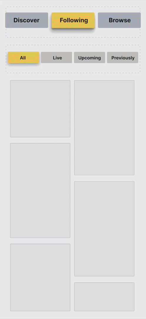
Access Amazon Live easily
You can easily access Amazon Live through the tab on Amazon now.
Impressive homepage
Navigation x Search bar
Minimalistic navigation makes it easier to decide what to look for.
You can tap or swipe the screen to switch the navigation tab.
The search bar helps you find what you need faster.
Secondary navigation
You can directly filter the different time-dependent streams by subcategory.
The order of the tabs in the secondary bar is based on left-to-right reading habits. The more frequently the tab is used, the farther to the left it is placed.
We make previous video streams black-and-white. Because It creates a lower-level color flow as people pay more attention to color.
Set reminder for upcoming streams by tapping the new intuitive reminder button.
It's shaped and sized for a finger click.
The icon is a bell visual metaphor.
After clicking, it will respond by changing to orange.
Set reminder
The discover page in the new version provides personalized recommended videos based on the algorithm. The algorithm will be affected by the following:
Amazon searches
Amazon purchase history
Amazon Live searches
Amazon Live watched history
Following creators and similar creators
Personalized recommendation
Update the screen whenever you choose
Pulling down on the screen and then letting it go will refresh the screen. It will make you feel convenient and natural.
Jump to your favorite creators’ live stream quickly.
You can quickly access the live streams by tapping the red circle in the following list.
Versatile following list
Easily find the people you follow
We created the following list to make finding the people you're looking for easier. There are two ways:
Search keywords through the search bar
Search by filtering followers, brands, and influencers
Sorting
By tapping the sorting button, you can control which time relevance you want to see the results.
Effortless search
See the four search ways above the fold at a glance
When you arrive at the search page, at a glance, you will see the four search ways above the fold.
Search bar
Recent Searches
Suggested Searches
Categories
We set the top of the keyboard below the heading "Categories" to ensure you can see the "Categories" heading when you open the search page.
Search keywords
Recent searches
It shows shortcuts with your latest searches, so you can select instead of recalling, decreasing memory load.
You can delete one-time history or entire history.
Suggested Searches
When unsure which to search for, you can look to suggested searches based on personalized recommendations.
Tap the shuffle button to refresh the suggested searches.
See more categories at a glance
We've shrunk down the pictures of categories from the old version to help you see more categories at a glance.
Seamless watching experience
Picture-in-Picture (PiP)
We provide the Picture-in-Picture (PiP) feature, which allows you to minimize the video being played to one corner of the screen, so you will never miss any part of your stream.
Depending on the scenarios, we got two types of picture-in-picture:
Auto PiP
Manual PiP
👇
Auto PiP
When you tap a product window in the product listing, you will jump to the Amazon product page and automatically enter picture-in-picture.
Manual PiP
When you want to simultaneously browse something else on Amazon Live or your phone and see the current video, you can manually tap the picture-in-picture feature in the upper right corner of the video.
Stick with the products you like
Horizontal Product list and '“Back To Current” button
Unlike the old version, which is partially blocked, you can see the entire live-streaming window while viewing the new horizontal product list.
While checking the product list, you can return to the product introduced anytime by tapping the "back to current" button.
Easy to add products
You can tap the “Add to Cart” button to add the products you are interested in.
Collapsible product list
When you change the screen from vertical to horizontal, you will only see the current product window because the long product list will obscure the video.
Tap the down arrow to unfold the product list; Tap the up arrow to fold the product list.
draggable Product list
If you feel that the product list position obstructs you from watching, you can drag it to any place on the screen.
The impact
Access right streaming pages faster
WatchTime on videos increased
Adding products just got faster
The satisfaction rate improved

ultimately, they will
Improve user retention
Boost sales & revenue
Takeaways
As a design lead, I was involved in every stage of the design process, cultivating design skills, leadership, time management, and collaboration skills.
I created a new design process model, cultivating my ability to method selection and project management.
I had a deeper understanding of the design system.
The iterative design doesn’t have to be great to get started, but it has to get started to be great.
Run user testing to support design decisions instead of arguing.
Rise to the challenge to explore effective but low-cost testing.
Keep your eyes on the prize, HWM.