

AI Meeting Translator
Reading time: 3 minutes
My Role
Research + UXUI
Device
Responsive Web
Tool
Figma
Context
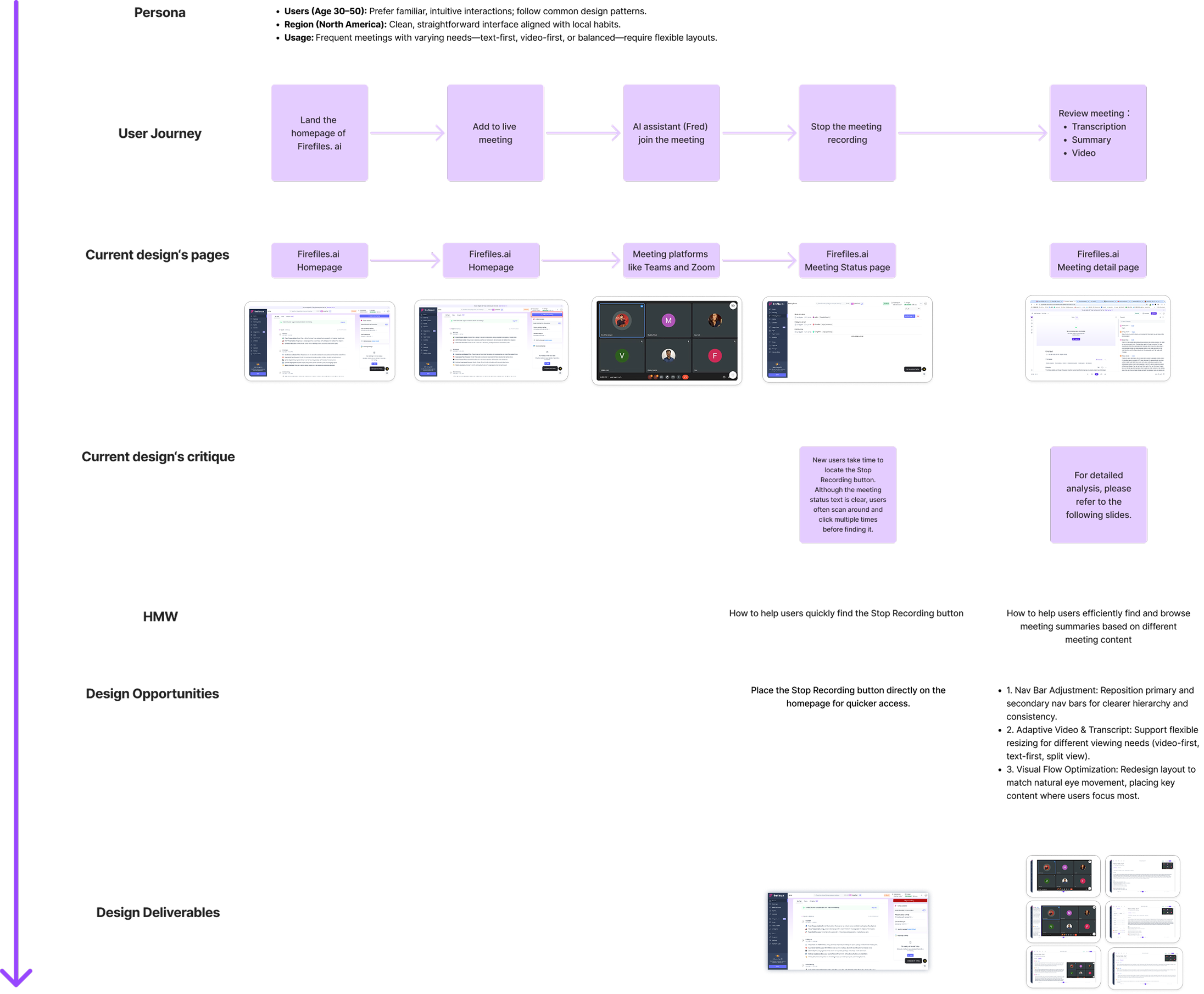
Fireflies.ai is an AI-powered meeting platform offering recording, transcription, and summary capabilities
Target User
Office workers in North America, typically aged 30-50, who frequently participate in video conferences.
Design Goal
Enhancing Fireflies.ai's meeting summary experience
Design Process
‘Stop Recording’ Feature
Before
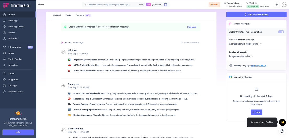

Critique:
New users take time to find the "Stop Recording" button, as it requires frequent switching between the homepage, meeting, and status views despite the clear status text.
After

Design Improvement:
Replace “Add to Live Meeting” with “Stop Recording” on the homepage during recording to simplify the flow and improve efficiency.
Nav Bar
Before
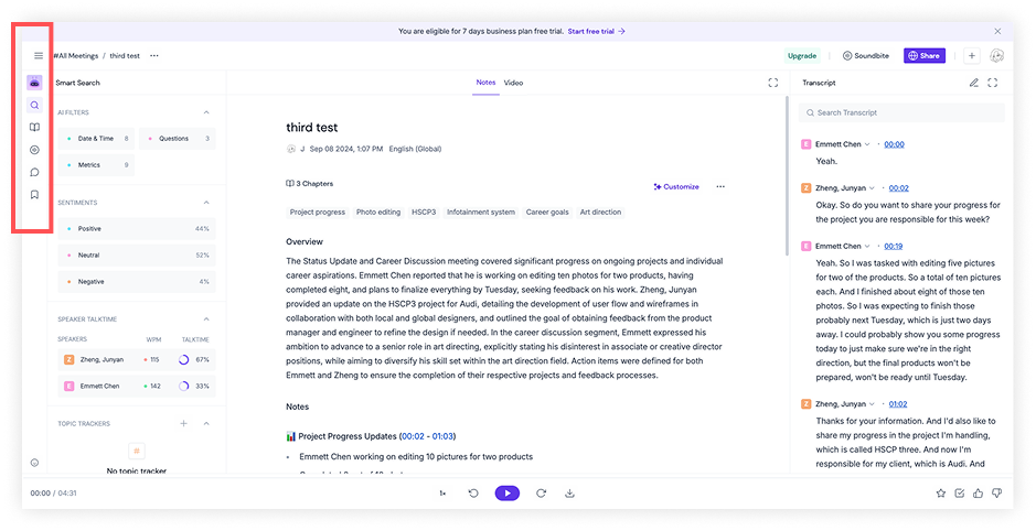
Critique:
Secondary vs. Primary Nav Confusion: The vertical Secondary Nav resembles the Primary Nav, confusing.
Primary Nav Visibility Issue: The Primary Nav is hidden until hover, violating the Visibility of System Status principle, making it hard for users to see the system state or available actions.
Button Overload and Poor Layout: Too many buttons and an unfriendly layout disrupt visual flow, increasing search time and cognitive load.
After
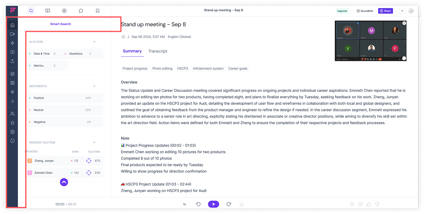
Design Improvement:
Keep both the Primary and Secondary Nav Bars always visible to ensure system status transparency.
Differentiate between the Primary and Secondary Nav Bars with distinct styles to avoid confusion.
Maintain consistency in the Primary Nav Bar across all pages to ensure UI uniformity.
Optimize the collapsing behavior of the Secondary Nav Bar — it should slide up when clicked.
Align all icons horizontally for easier and faster user selection.
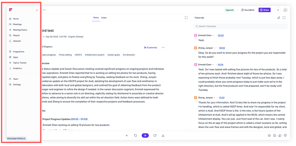
Meeting Detail Page
Before

Critique:
“Notes” lacks clarity: The label is vague and overlaps with “Overview” and “Action Items,” confusing.
“Video” content is redundant: It duplicates information from “Notes,” making the distinction unclear.
Transcript should be prioritized: As a key reference for users, it deserves a more prominent position than video.
Weak visual hierarchy in tab labels: “Notes” and “Video” tabs are visually understated and easy to miss.
After


Design Improvement:
Rename “Notes” to “Summary” for clearer communication of meeting overview, key points, and action items.
Make “Summary” and “Transcript” the primary tabs, with “Transcript” prioritized and centered for quick access.
Increase the font size of these tabs to emphasize their importance and improve usability.
Place the meeting title above the tabs to maintain a clean and logical interface.
F-Shaped Pattern


The F-layout has three key features:
Top horizontal scan: Users first scan the top of the page horizontally.
Secondary horizontal scan: They then scan a shorter horizontal line slightly below.
Vertical scan: Finally, users scan vertically down the left side, occasionally moving right at points of interest, forming the shape of an “F.”
This pattern reflects typical user behavior during quick web browsing, emphasizing the importance of placing key information at the top and left edges for maximum visibility. Both Google and Baidu search results follow this F-pattern layout.
Adjustable Layouts
Users can drag to switch between different layouts—small, split, medium, and full-screen video—to adjust the video-to-transcript ratio.

Transcript-First Mode:
Scenario: Many meetings focus on speech without video.
Design Improvement: Prioritize the transcript with optional video playback.

Transcript-Only Mode:
Scenario: Many meetings focus on speech without video.
Design Improvement: Prioritize transcript with optional video playback.

Transcript + Video Mode:
Scenario: For users who prefer video with subtitles or need transcript support during international meetings.
Design Improvement: Split-screen layout for synchronized viewing of video and transcript.